A new opportunity is soon approaching, but I can’t share any details at this time. Stay tuned.
Smule is the social singing app that lets you enjoy millions of karaoke songs. Connect with your friends from all over the world or sing with top artists!
I joined Smule in 2020 as a Senior Product Designer and a year later was promoted to Lead Designer. As Lead Designer, I contributed to leading features that focused on user growth and improved user experiences, design strategies and mentoring other designers.
Working with my product and engineering partners, I developed a number of features around optimization, improved search functionality, and Lyric Animations (seen here).
Case studies can be viewed here (Password required).
Caffeine is a new way, you and your friends can enjoy or create live, interactive content focused around gaming, entertainment and sports.
As a Product Designer, I love working with all disciplines. The best product experiences come from collaboration and the success of Caffeine’s rebrand is attune to that hard work and that collaboration.
My design contributions to the rebrand focused on improving the user experience through ideation, day-to-day design iterations and working with engineers throughout feature development.
I primarily focused on the broadcast experience, profile page and our monetization experience called “props” for both web and mobile development.
At Massdrop (currently called “Drop”), I worked with the product team designing features that drove user retention and buyer conversion.
Working with key stakeholders, I helped develop Massdrop’s new responsive web page through a process of ideation, design iterations and the creation of final design specs for the engineering.
At Youtube, I was the designer helping a number of teams with their visual and production design needs.
When I joined the YouTube TV team, they were under a very tight deadline. One of the problems that I faced was inconsistent designs that broke the design system. I first had to identify where the system was broken and redesign the mocks to meet Google’s standards. I created final specs to engineers that lead to a timely release of YouTube TV with huge success!
In addition to helping the TV team, I also had the opportunity to create a new player for third party publishers who utilized YouTube’s network but also had the ability to add their brand to a custom player that would be displayed on their website. The problem was how to let third party sites add their brand but still use YouTube’s video player. Through a process of sketches, wireframes and identifying components the solution was to add the color to the play button and the lower navigation.
And finally, I had a few opportunities to work with YouTube’s Art Department to create informative illustrations for a number of features. For example improving a 404 experience or visually showing how to set up a hotspot account.
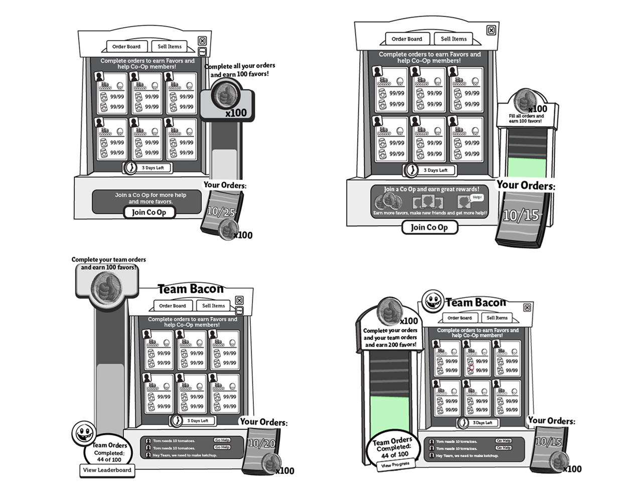
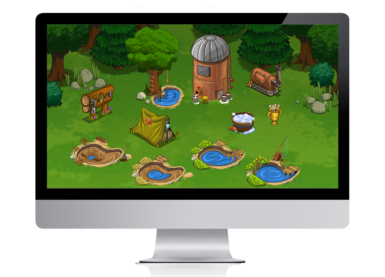
At Zynga, I worked on two of their larger franchises; Farmville 2 as an Experience Designer, creating core user experiences and Frontierville, as a 2D Artist, creating illustrations and animations.
On both franchises I worked with PMs, Producers, Engineers, Game Designers and QA to develop weekly sprints that led to bi-monthly releases that impacted millions of enthusiastic users around from the world.
In my free time, I like to illustrate whether it’s drawing in my sketchbook, creating a digital illustration or exploring traditional avenues of illustration. Most of my designs are available on my Society 6 page.
The skateboard design (see below) was created for the “Decked Out” Art Show a few years back and was inspired by the 80’s Powell Peralta film “The Search for Animal Chin”…
“They were really into finding Animal Chin; and I really couldn't blame em, went looking for him myself when I was their age. I don't mean the man; but what he stands for. They don't call him commander fun for nothing, and having fun is an art you have to Develop, Understand, Respect...”
This illustration was inspired by Powell Peralta's iconic skate film "The Search for Animal Chin".